KROMA
A concept for a colour-led fashion store, with its own FW26–27 collection campaign. Brand, campaign imagery, video and copy, carried through to a Shopify prototype.
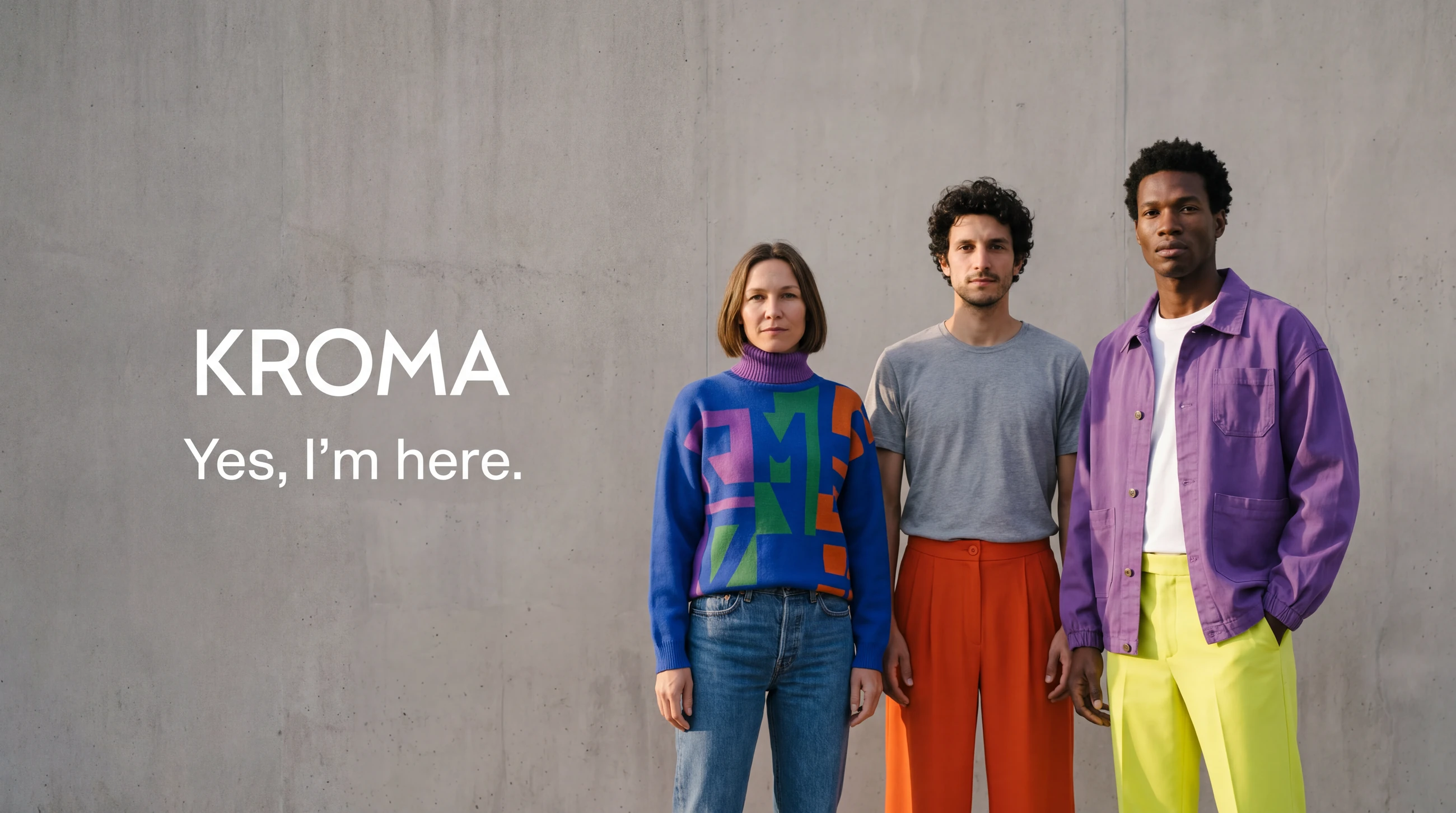
Colour as a stance
A curated fashion store concept built on one idea: in a world dressed in grey, wearing colour is a decision about who you are. Everything below — the voice, the rules, the campaign — comes from that.
“We are a fashion brand for people who use colour to define themselves, not to follow trends. In a world in uniform grey, wearing colour today is disruptive. People look at you. That is not a problem — that is the point.”
The positioning, written in Spanish for the capstone and translated here.One lockup, one line, one point of impact
The wordmark sits on the campaign image, never on a neutral background — as in the banner at the top of this page. In the feed it carries the same rule: colour first, one line, nothing else.


The palette is the collection
No brand colour chart was invented for the concept: the palette is the collection itself, read against grey concrete. Swatches sampled from the collection photography.
Typography
Bold grotesque for headlines, monospaced for product specs.
Backdrop
The grey city: pavements, transport, concrete. Never a studio white.
Contrast rule
Never a neutral product on a neutral background. The colour has to be the only impact.
Three rules the work has to pass
Be seen
If a piece does not stand out in a grey feed, it is not KROMA. Colour is the first act of visibility.
Authenticity
No idealising filters, no artificial sets, nothing that could not be defended in public.
Conviction
The message is not softened to be easier to swallow. No preaching, and no apologising either.
Who the brand speaks to
Three profiles from the strategy, each needing a different thing from the same campaign.
The visible nonconformist
Questions trends rather than following them. Wearing colour is not daring, it is consistent with who they are.
The converted sceptic
Has been let down by brands that promised and failed. Wants evidence, not a speech.
The one daring now
Always wanted to wear colour but something held them back. The first purchase is a personal test.
What shoppers value, in their own words
I analysed more than 200 competitor reviews with Claude to find recurring motivations and objections. These themes are research inputs, not a measured customer journey.
| Review theme | Creative implication |
|---|---|
| Colour and values | Give expressive colour a clear place in the brand story. |
| Quality concerns | Make product details visible and avoid unsupported claims. |
| Returns frustration | Make the proposed buying experience clear. |
What was mine
- Chose the positioning angle — identity, with the resistance to fast fashion folded in — from three options.
- Rewrote the positioning in the first person and added the line “People look at you. That is not a problem, that is the point.”
- Renamed the first principle from “Visibility” to “Be seen”, against the AI’s recommendation.
- Proposed the tagline “Yes, I am here.” and the insight that wearing colour reads as disruptive today.
- Wrote the FW26–27 creative brief. The brand strategy document was the team’s.
The campaign, generated and edited
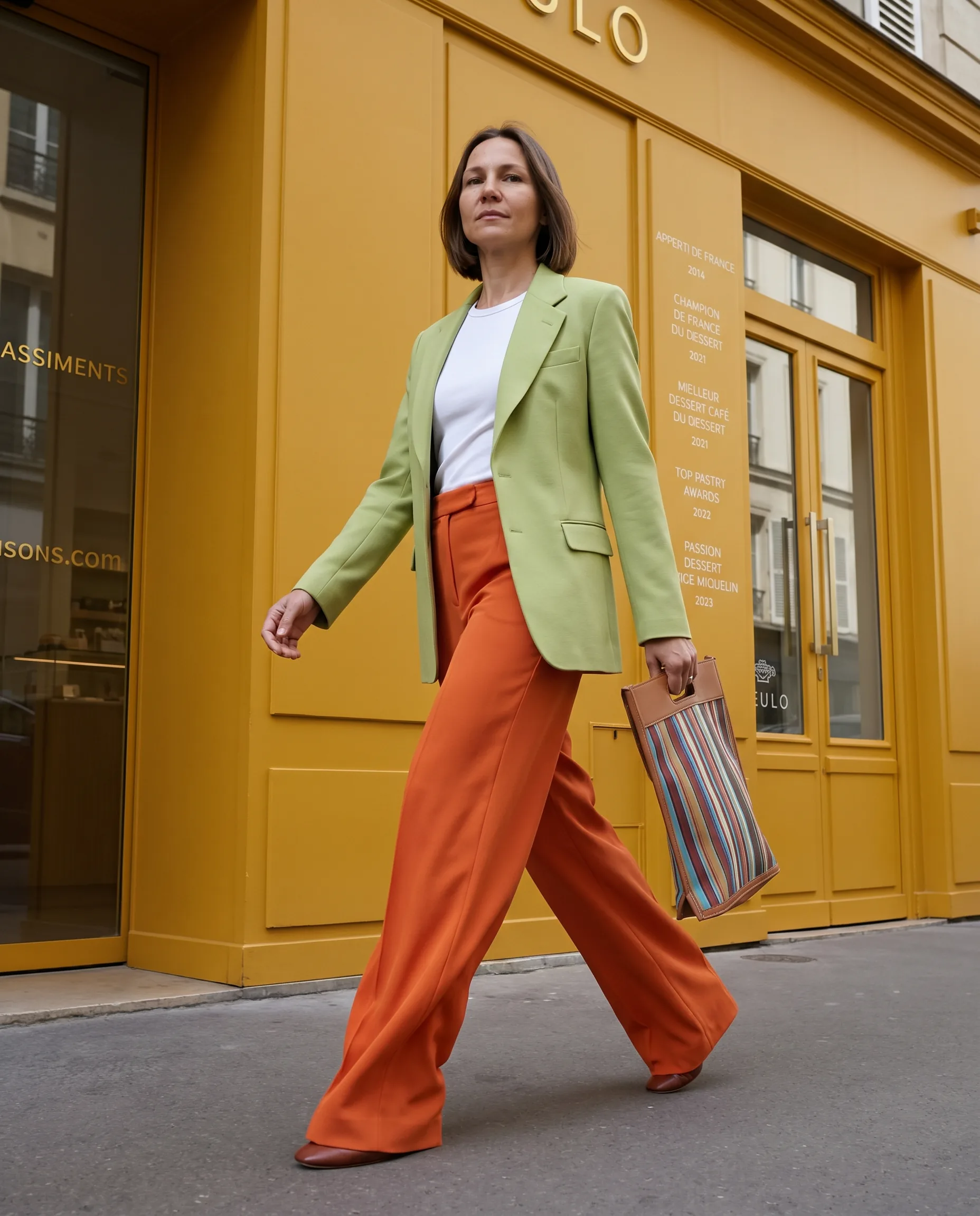
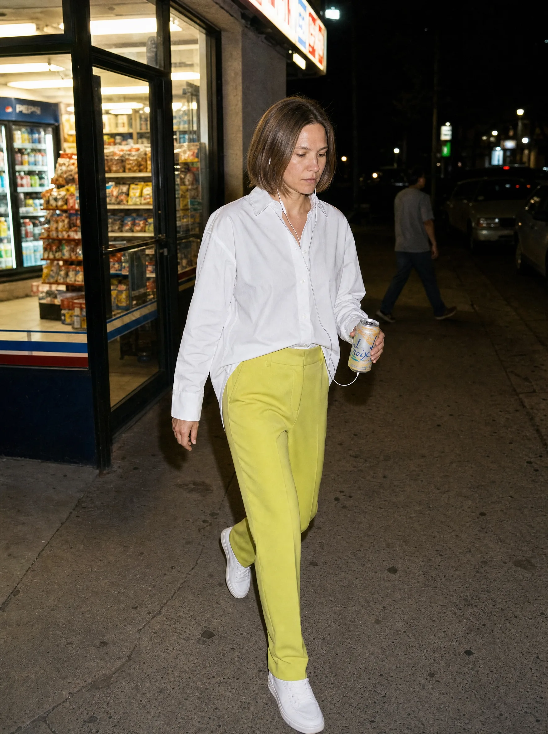
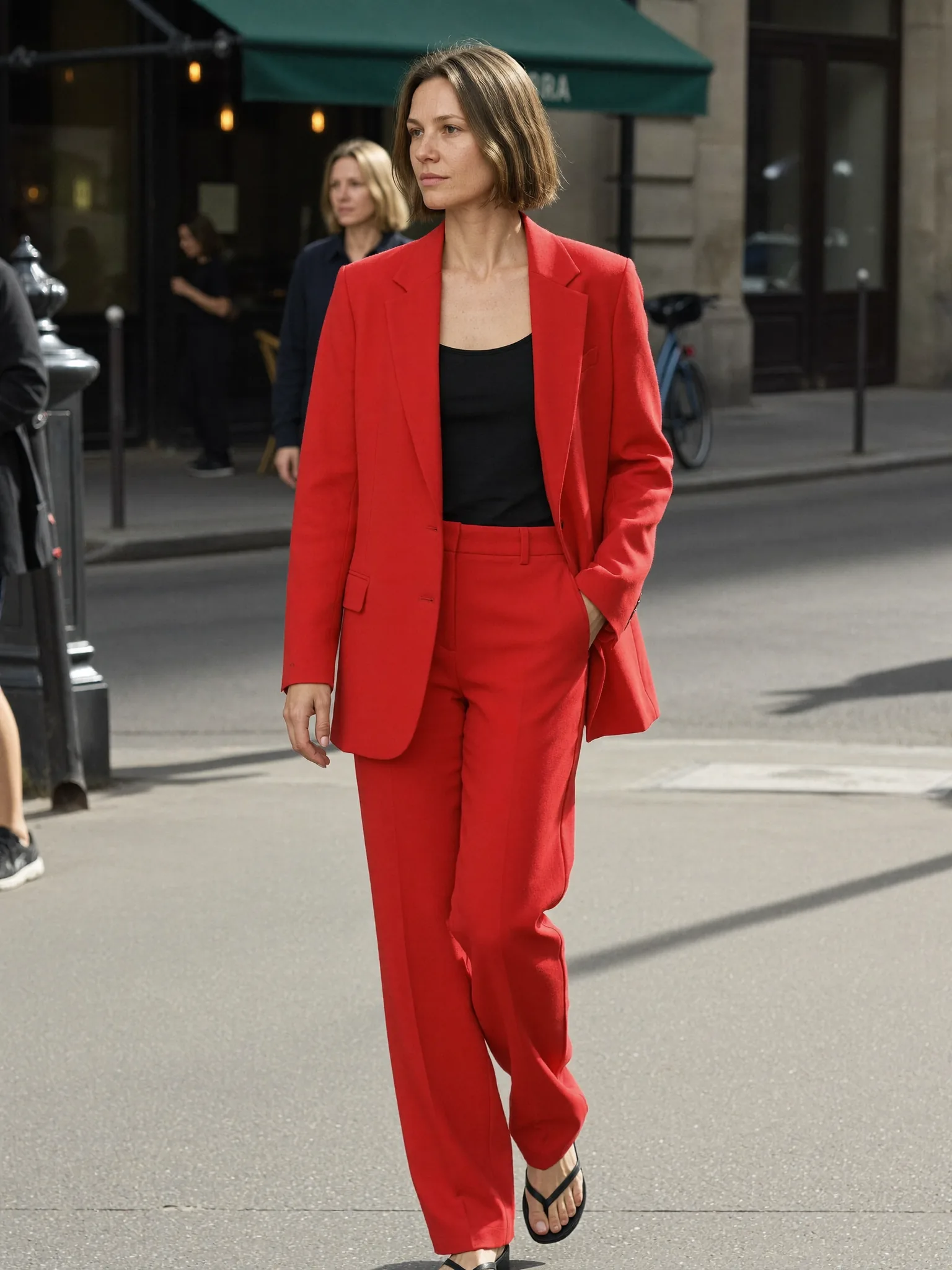
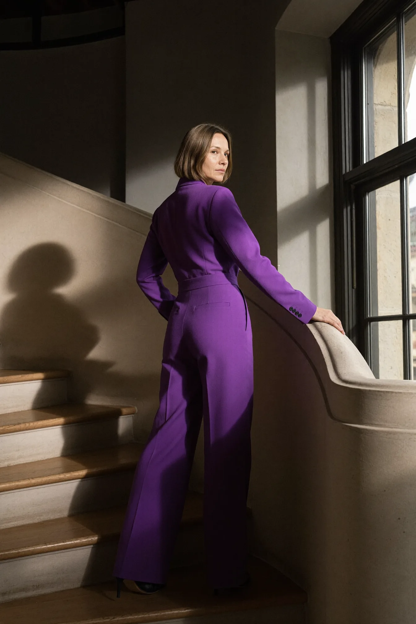
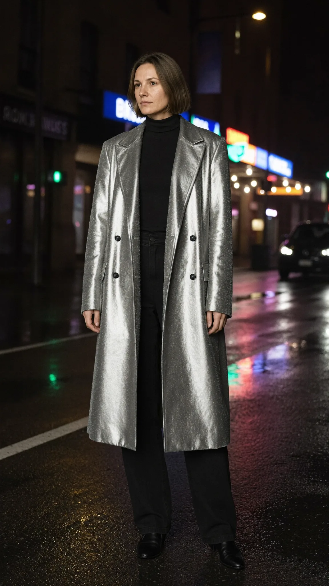
Prompted from the brief and the technical spec, generated in Magnific and Nano Banana, then an editorial pass by hand — checking colour, character and garment consistency across angles. No traditional photography anywhere in it.
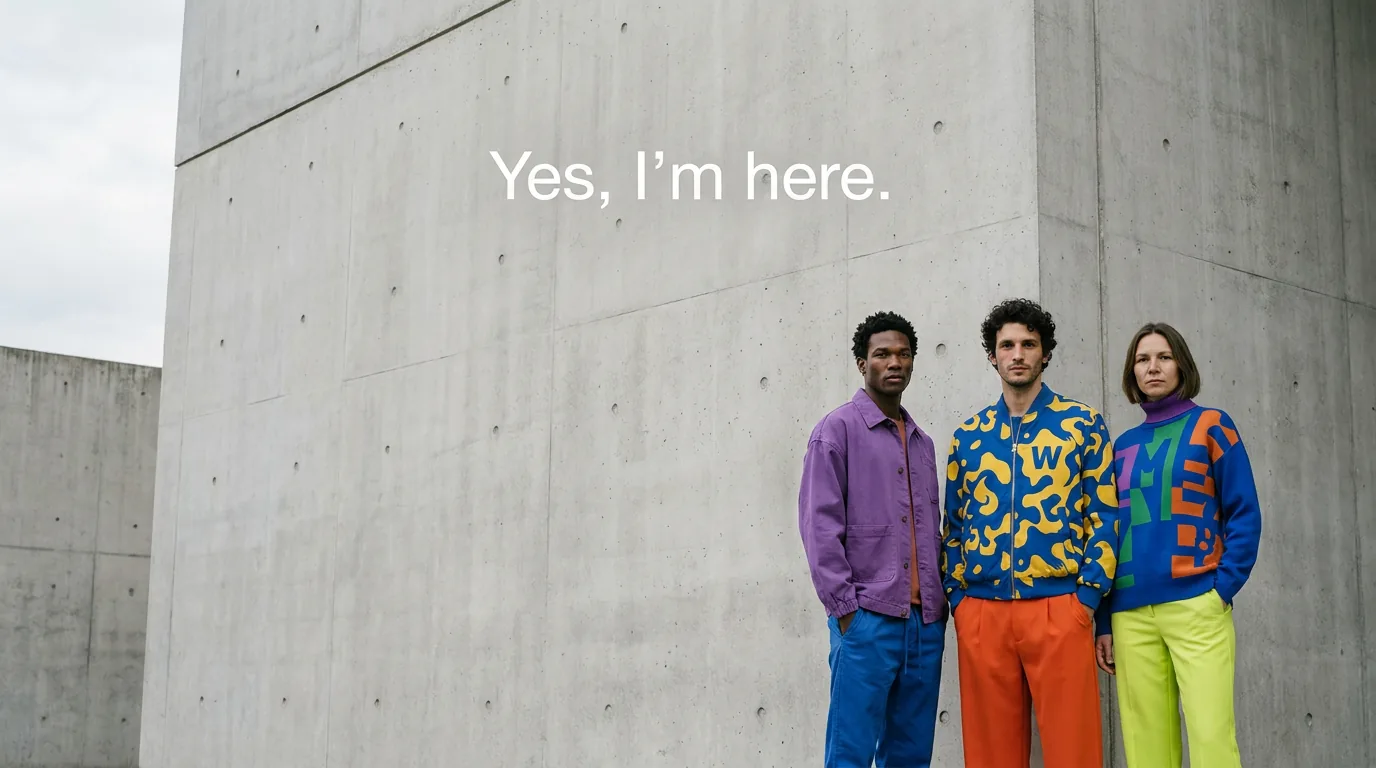
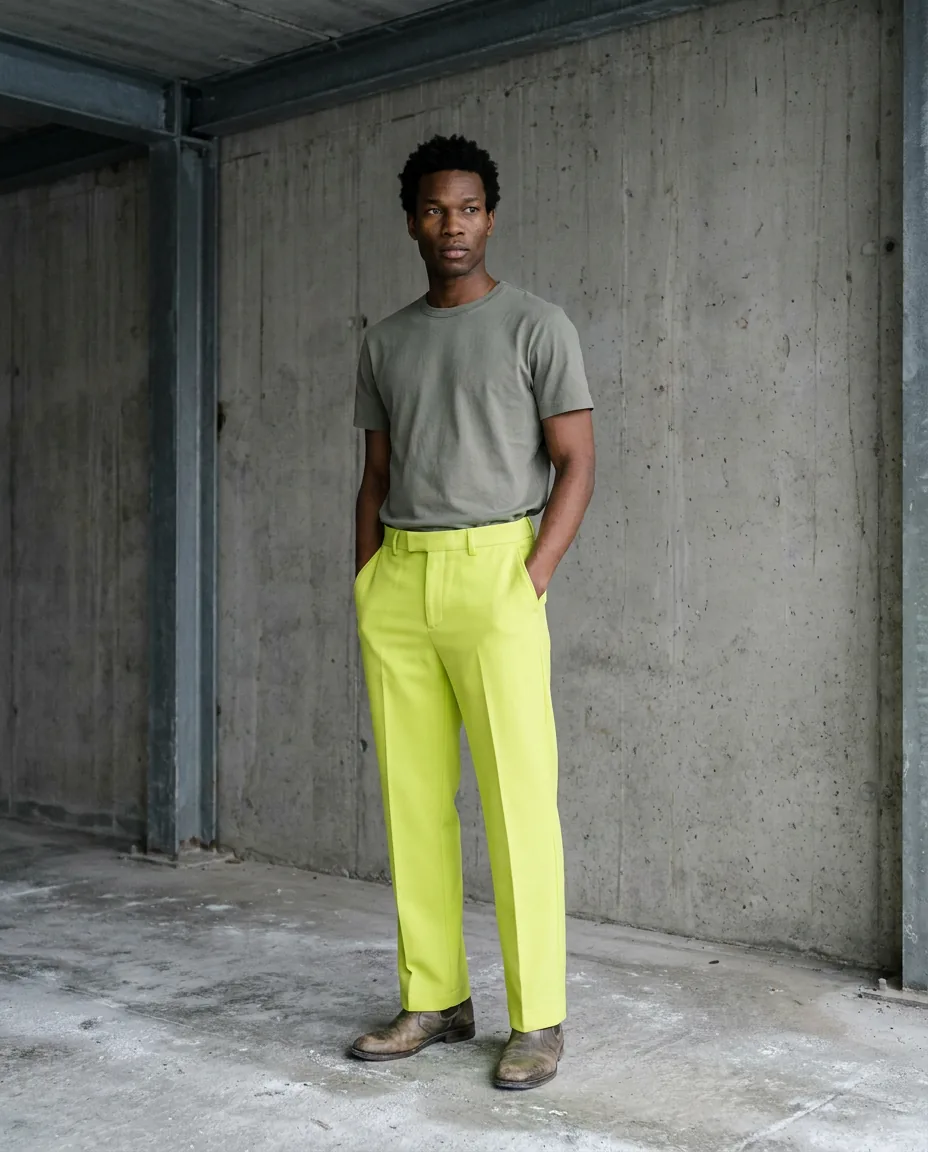
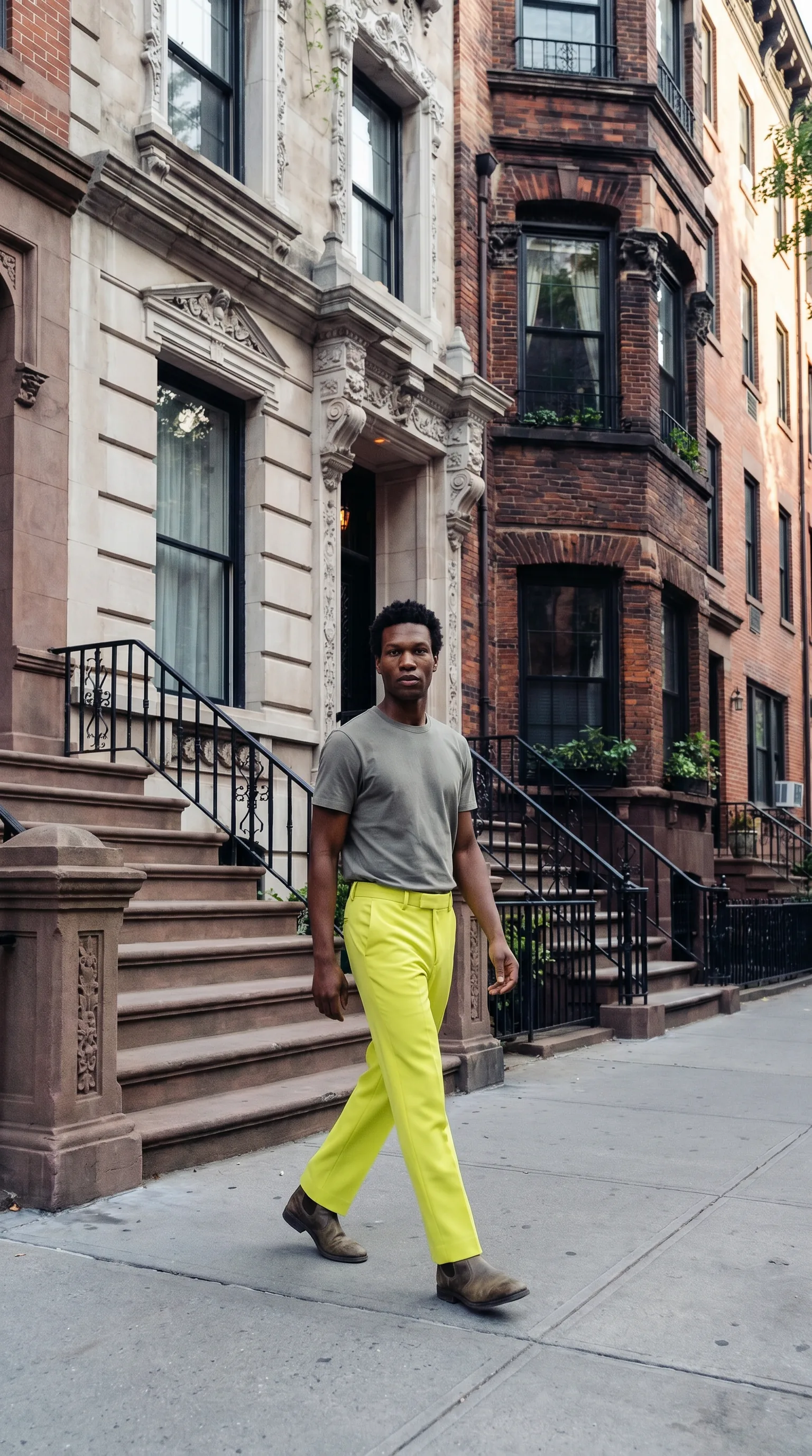
Colour as the only point of impact
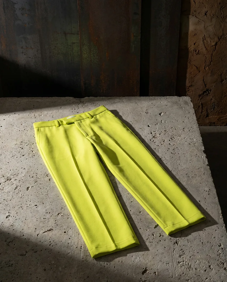
Hard flat light, raw concrete, naturalistic AI casting. The tagline closes every piece.
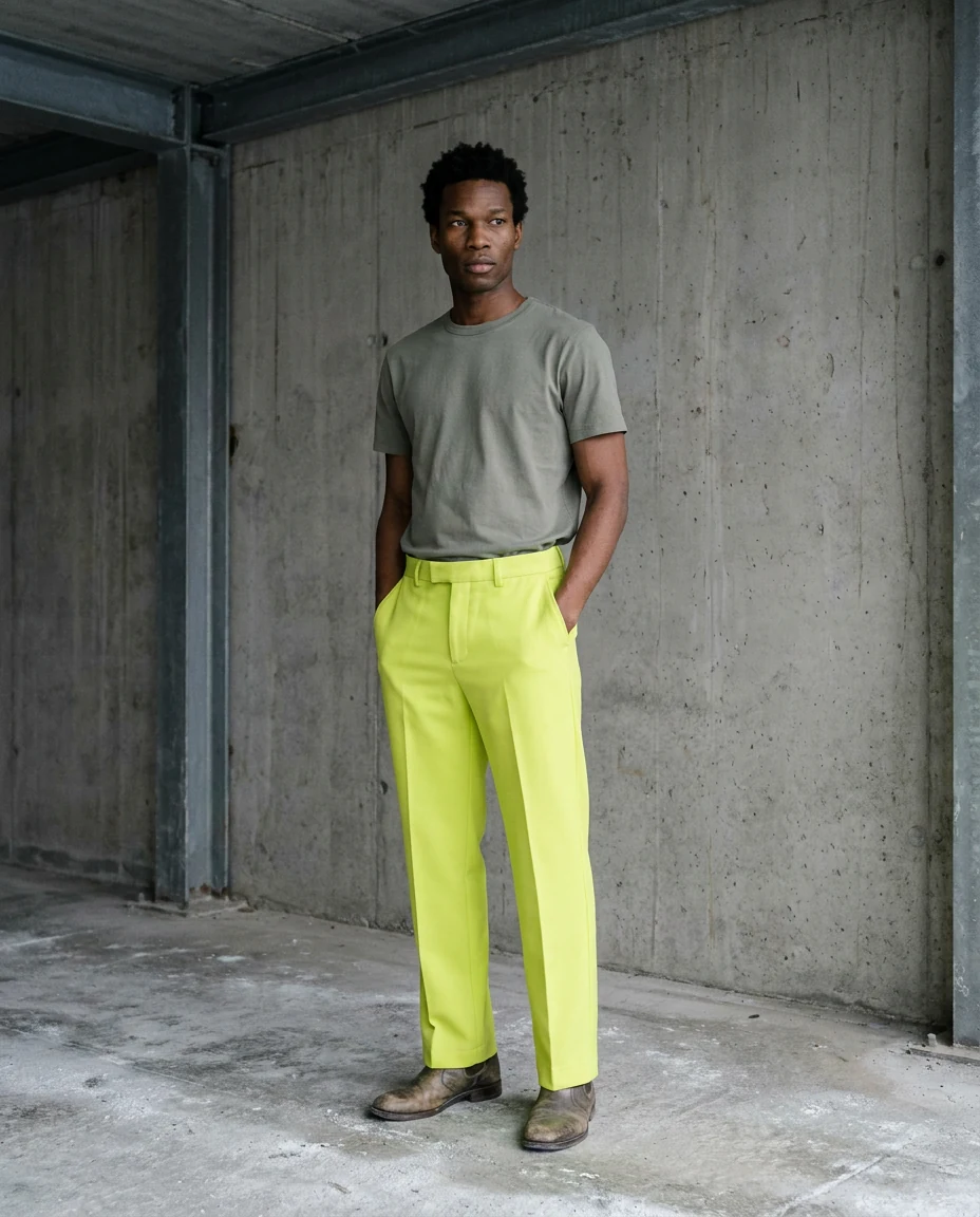
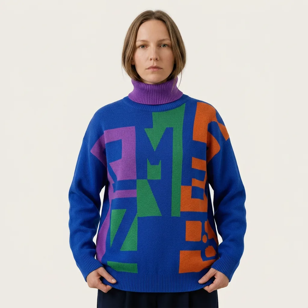
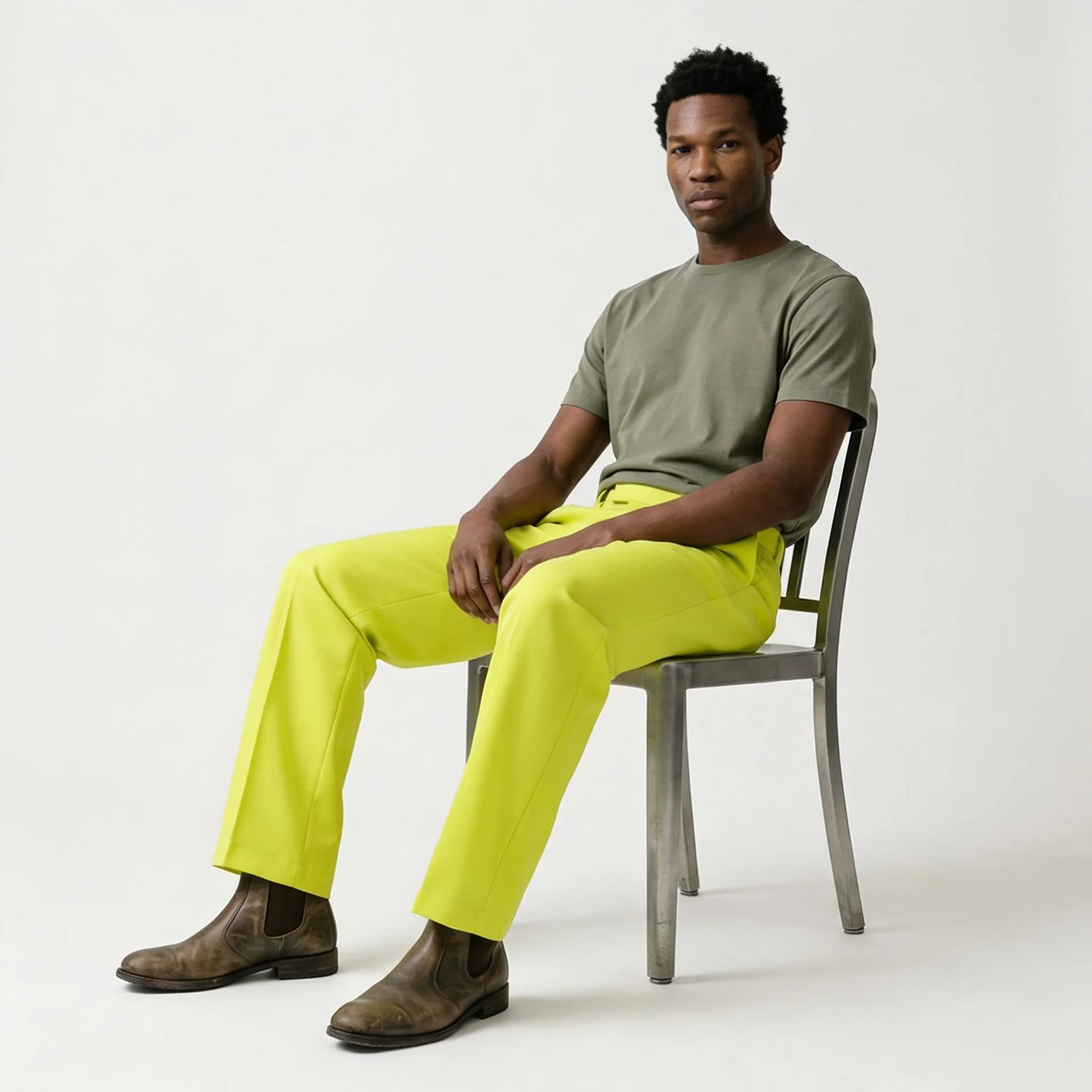
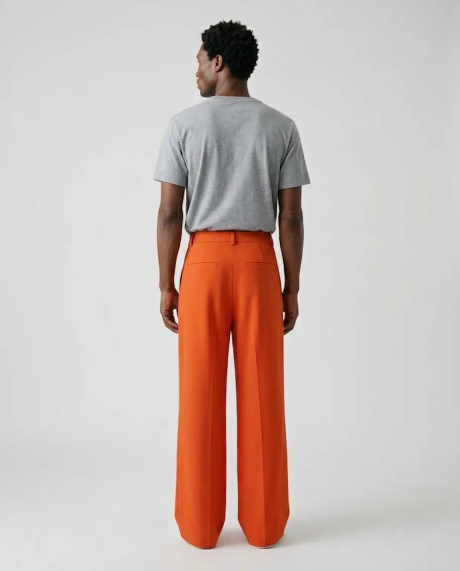
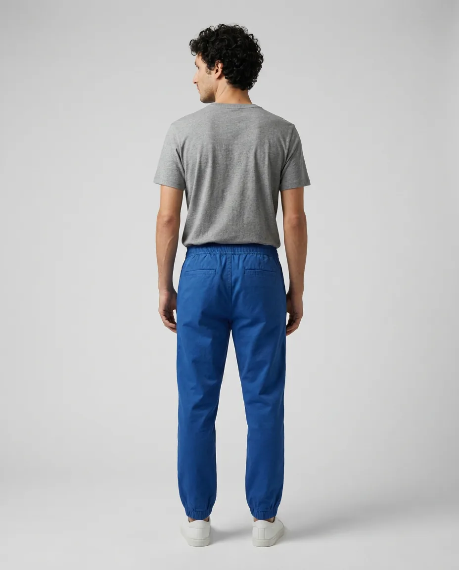
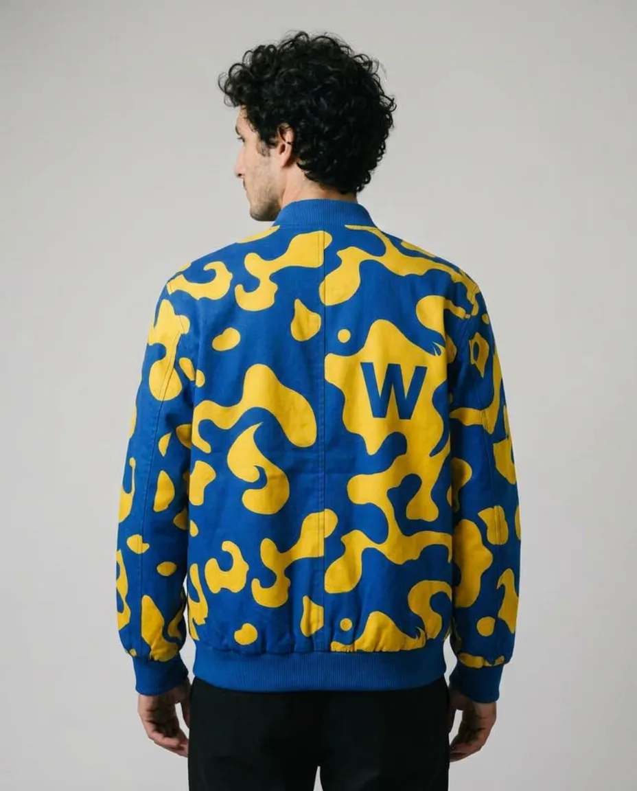
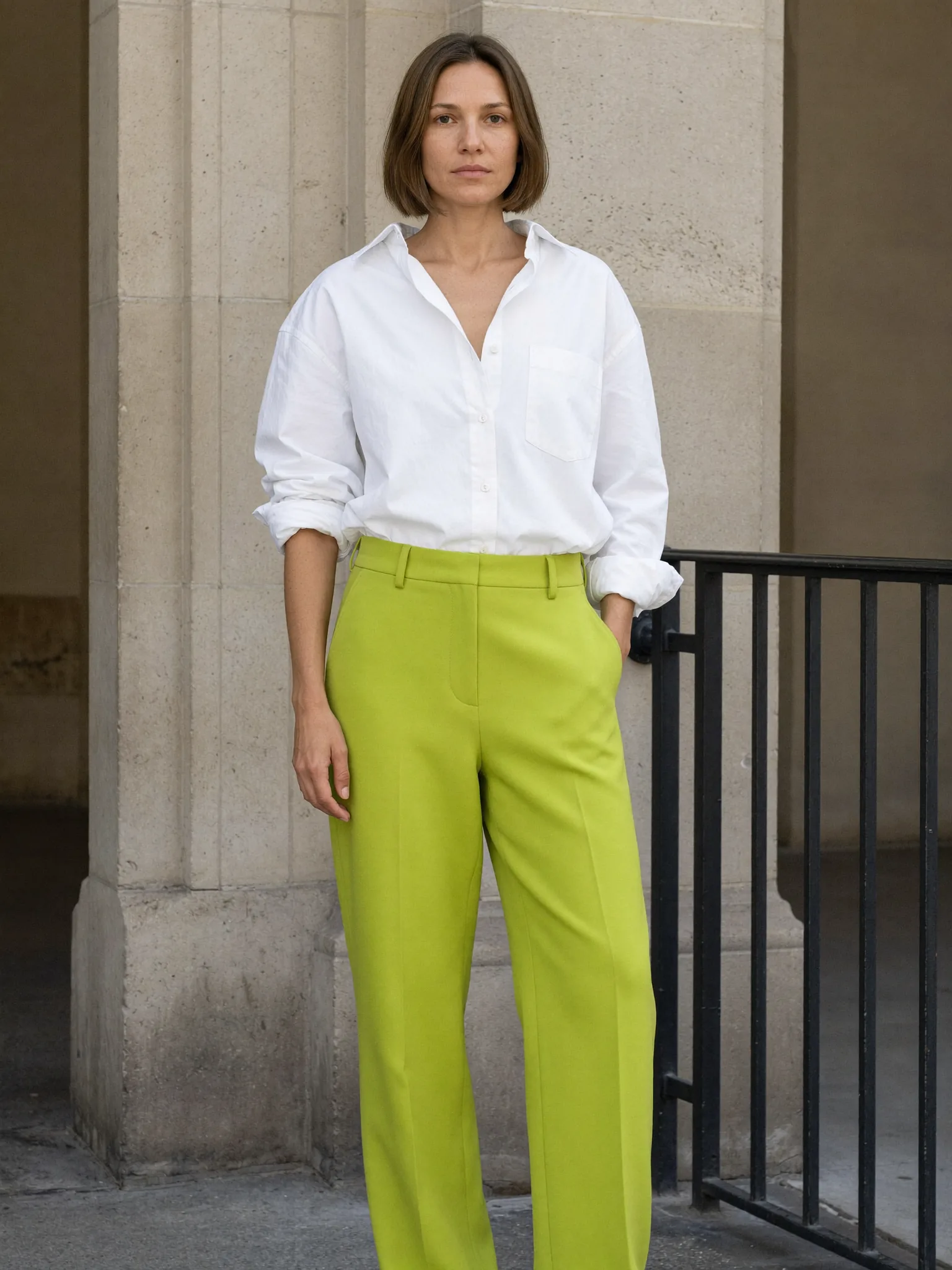
Six pieces, shot on model
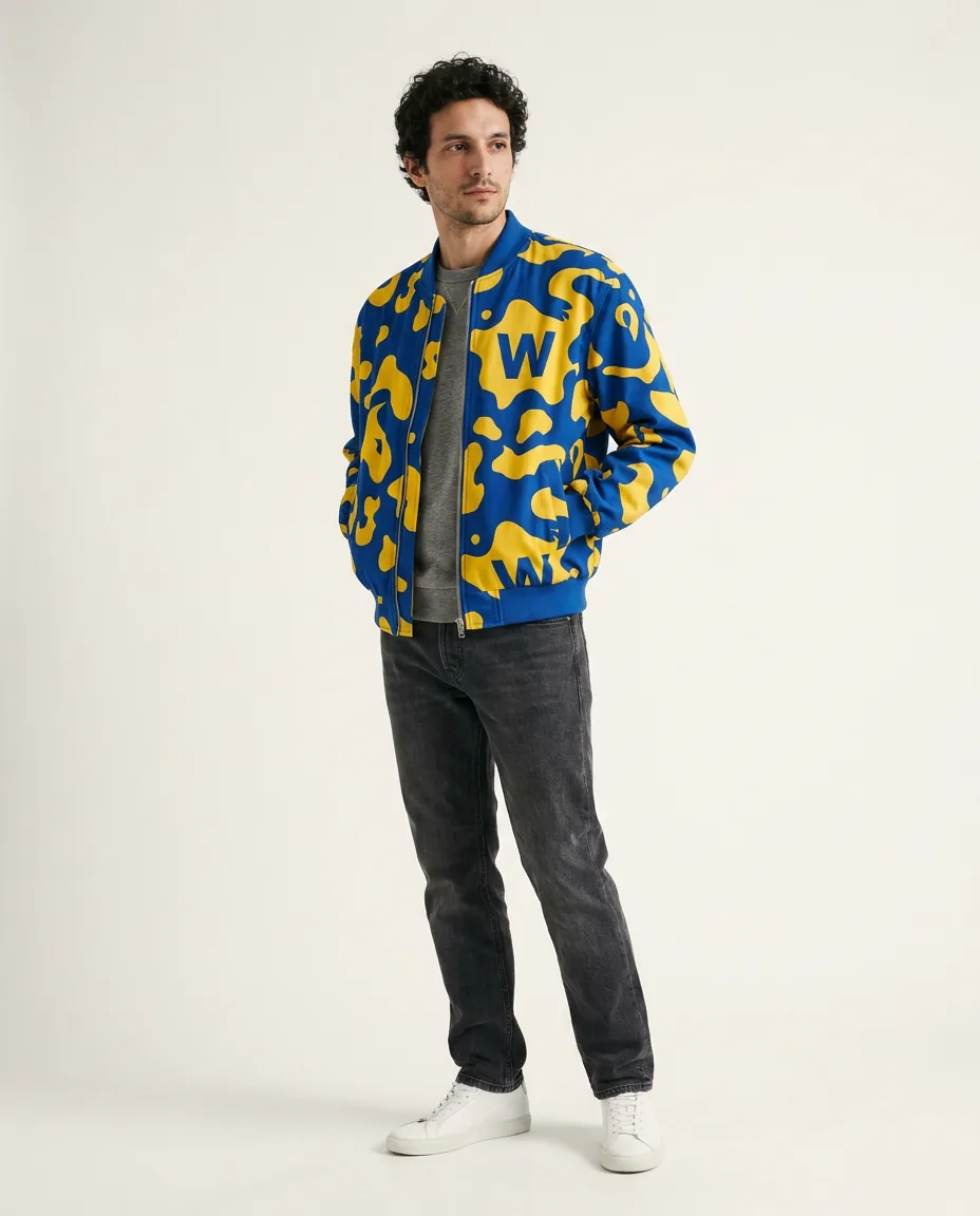
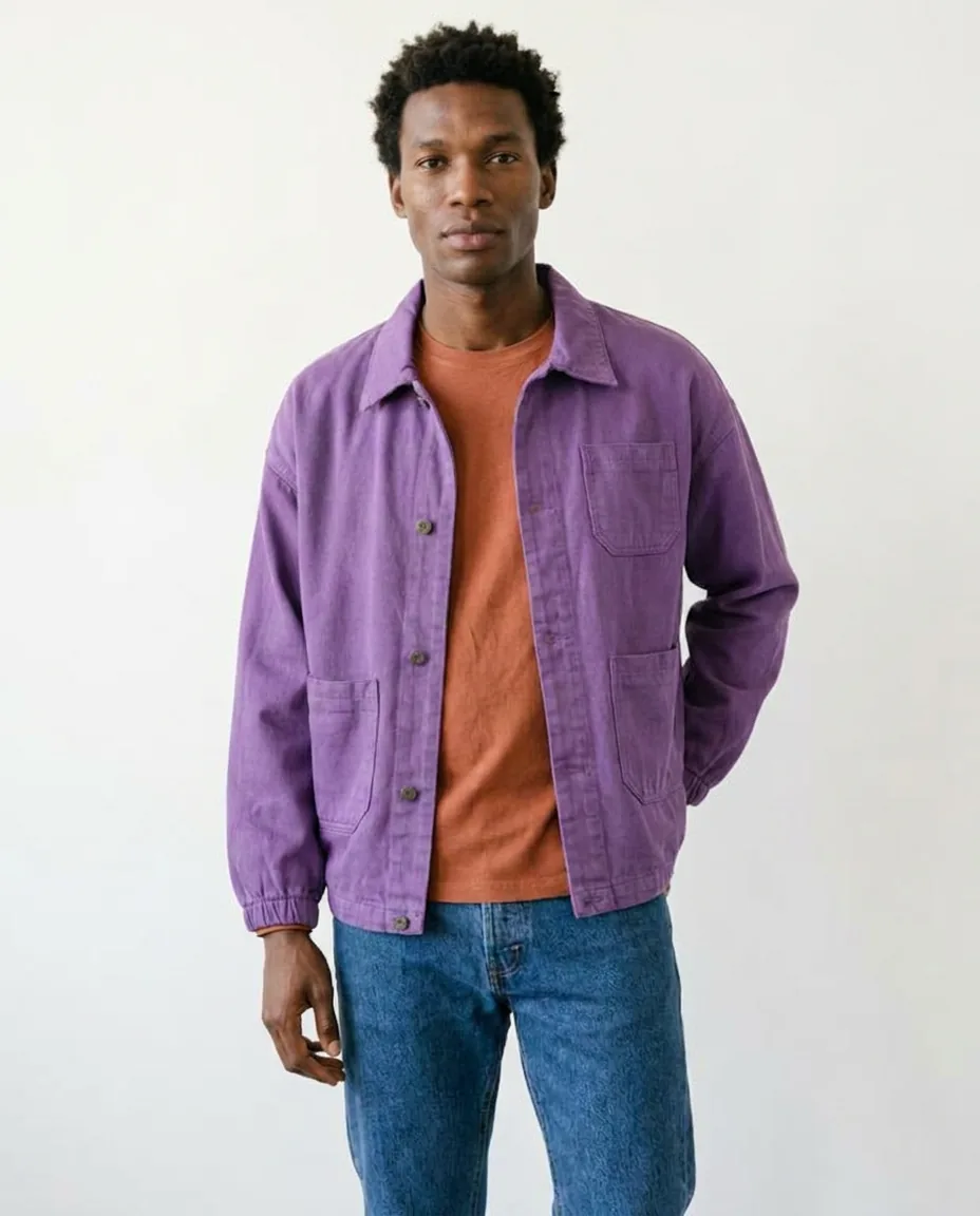
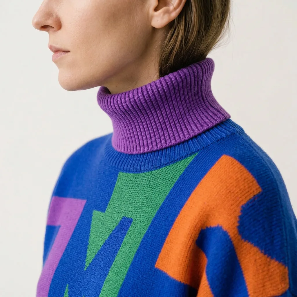
Six concept garments on AI-generated models, with casting and product references guiding consistency across views.
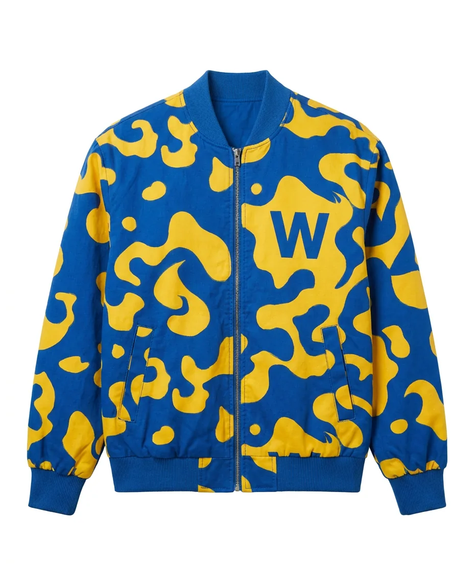
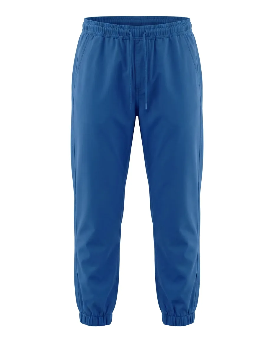
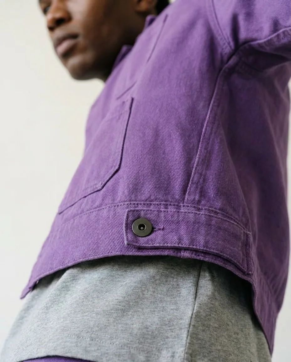
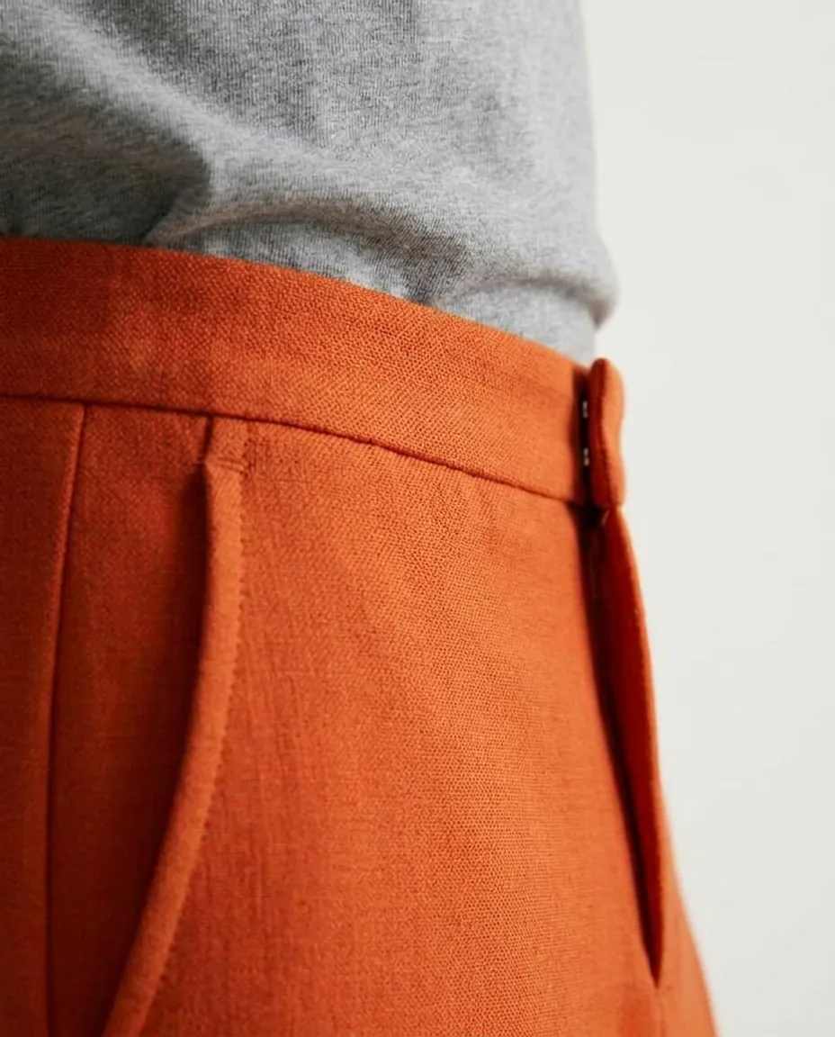
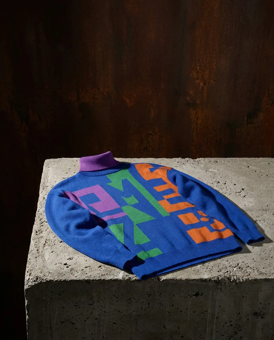
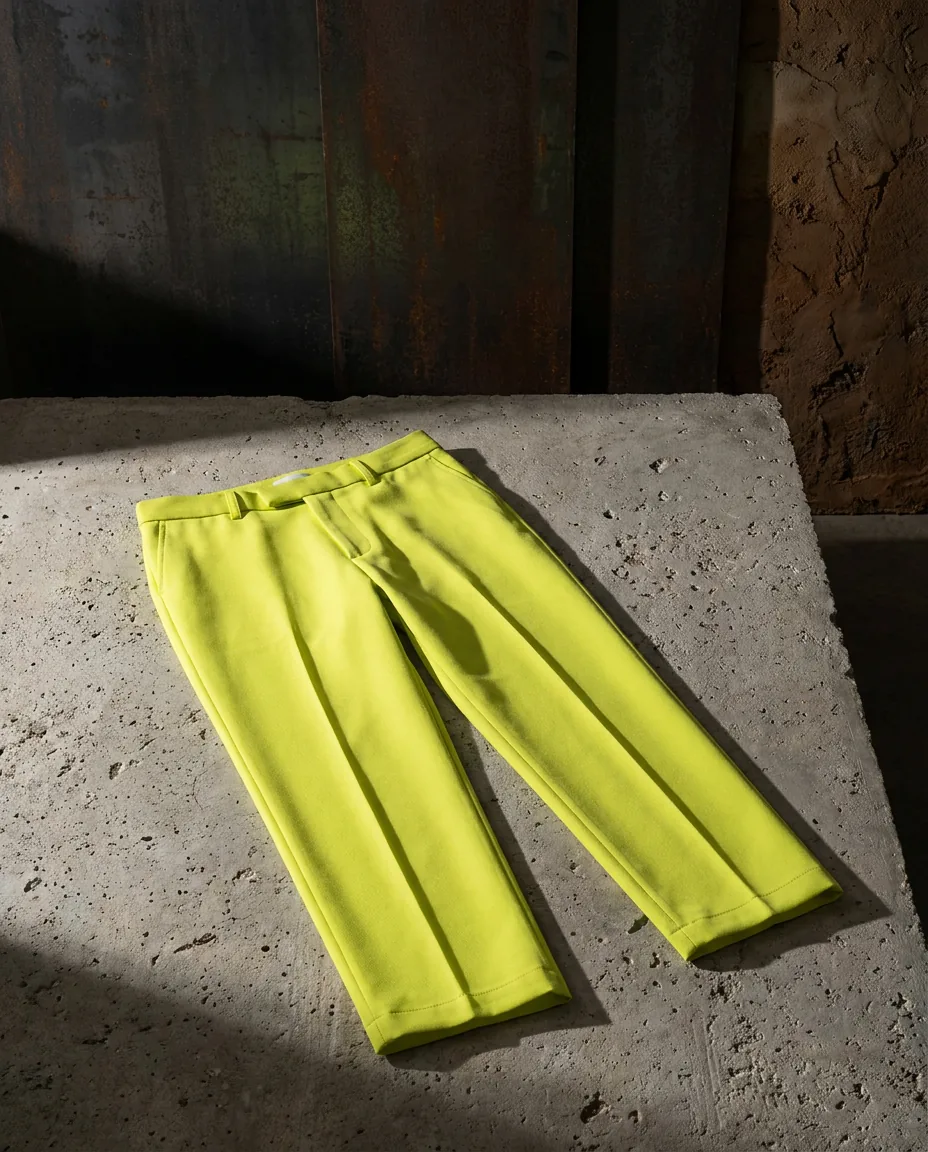
Flat lays, details and garments on concrete
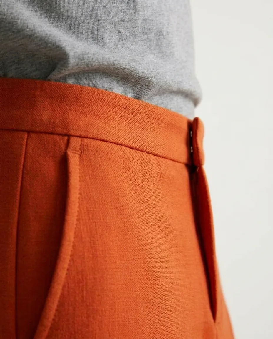
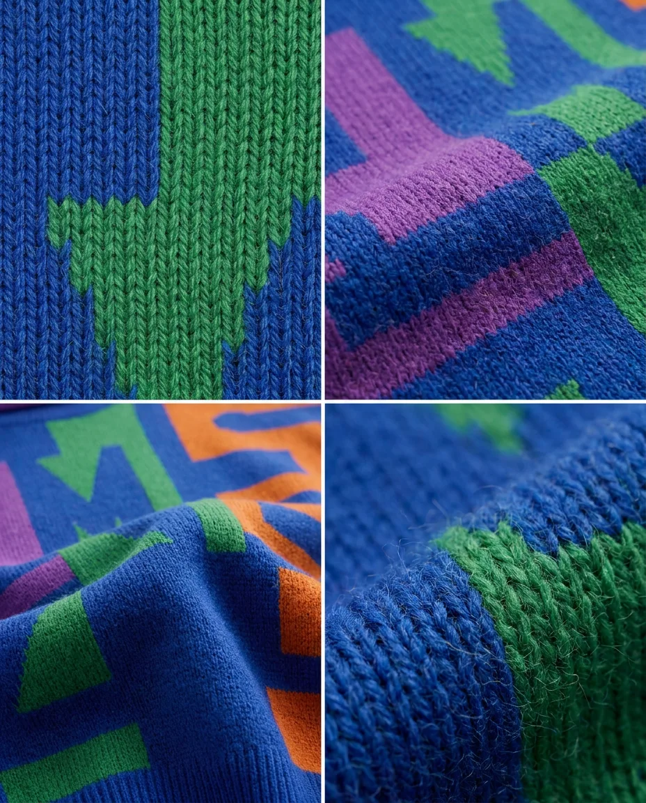
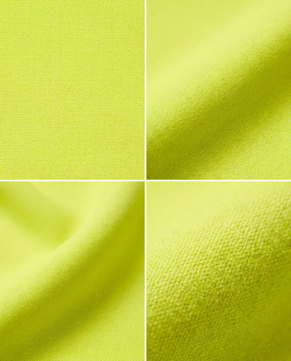
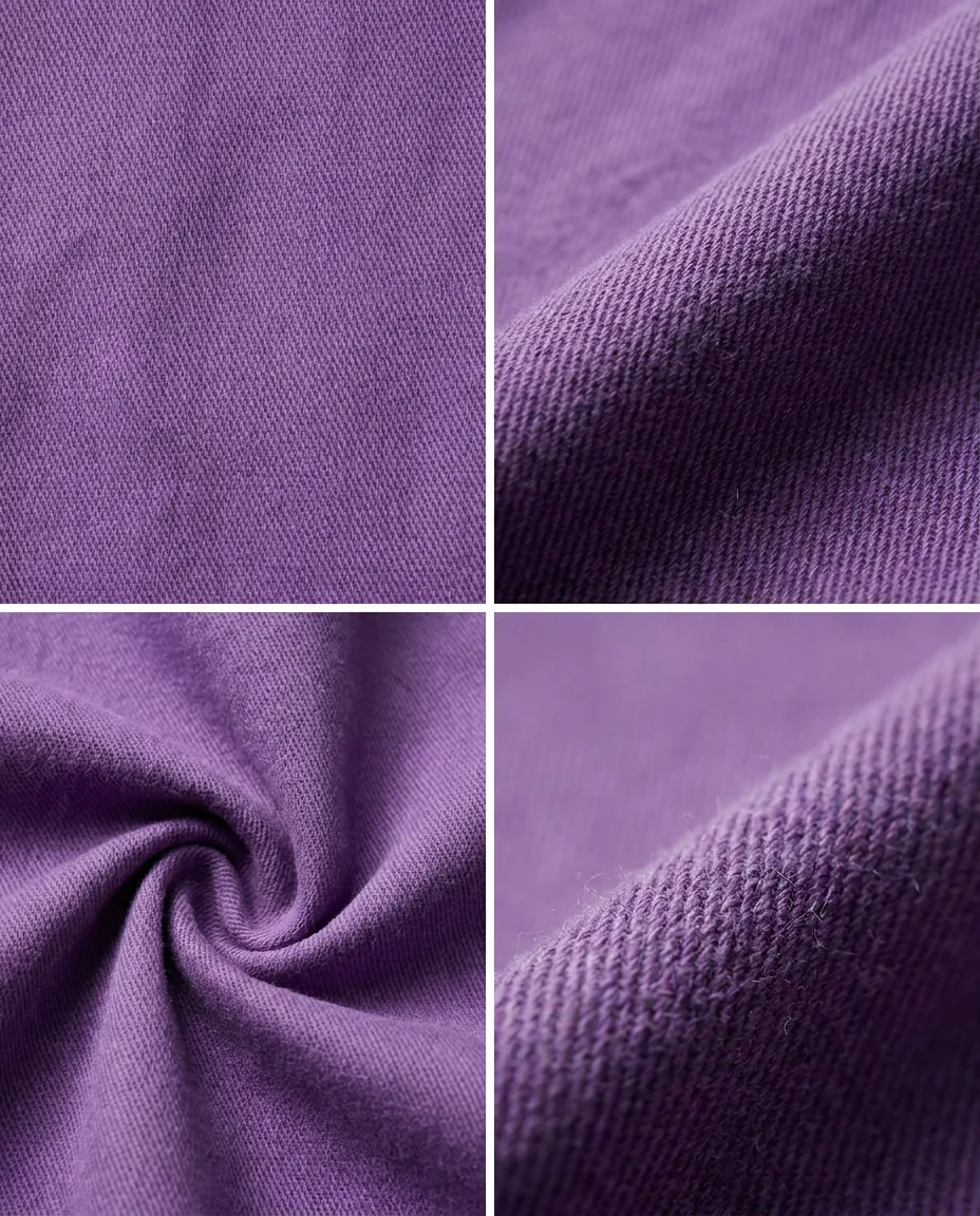
The pieces away from the model: fabric, construction and colour on mineral surfaces, with no styling props.

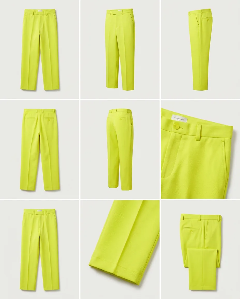
One garment, explored across nine angles
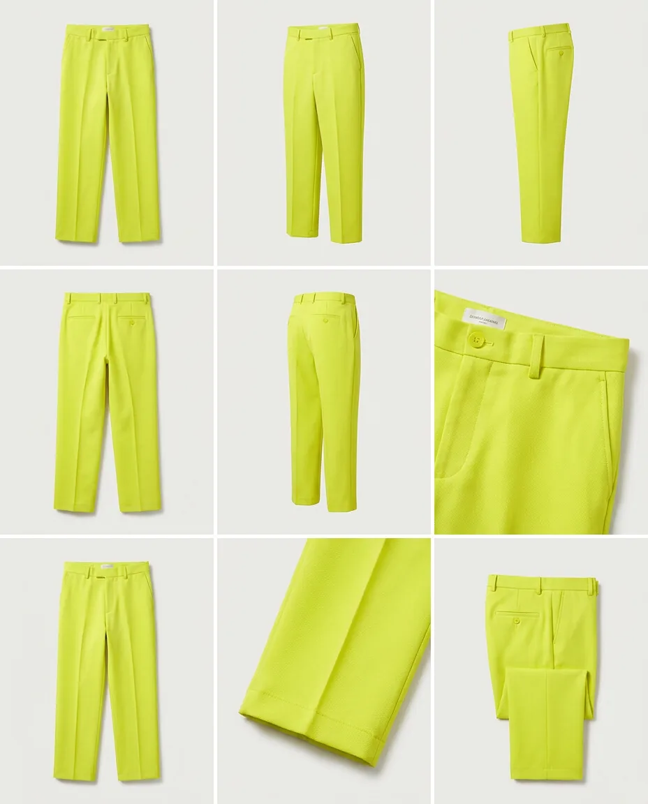
The hardest part of generating a catalogue is not the first image — it is the ninth still matching it. Each sheet makes it possible to check cut, colour and detail across views, and is shown whole, uncropped.
The full shoot
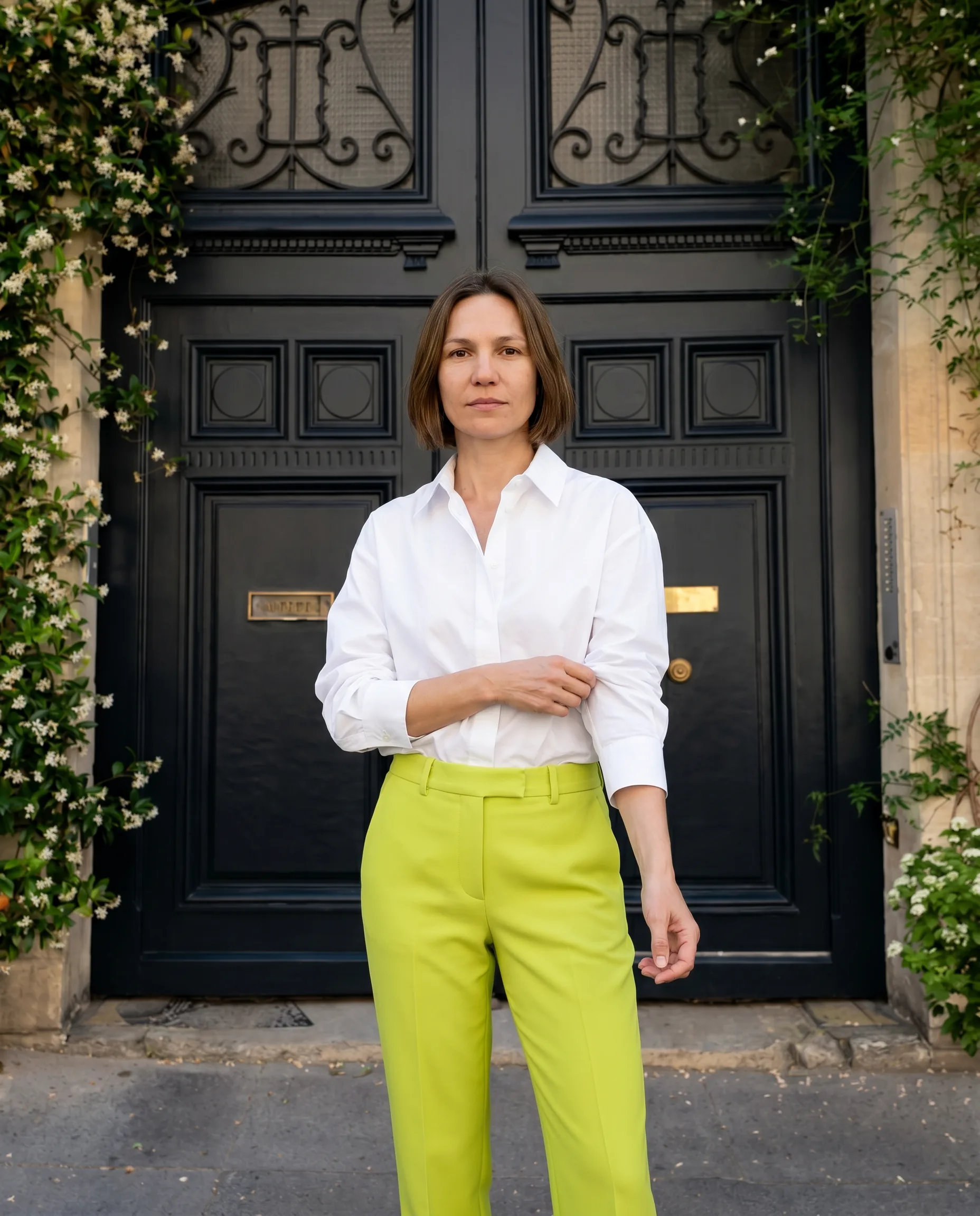
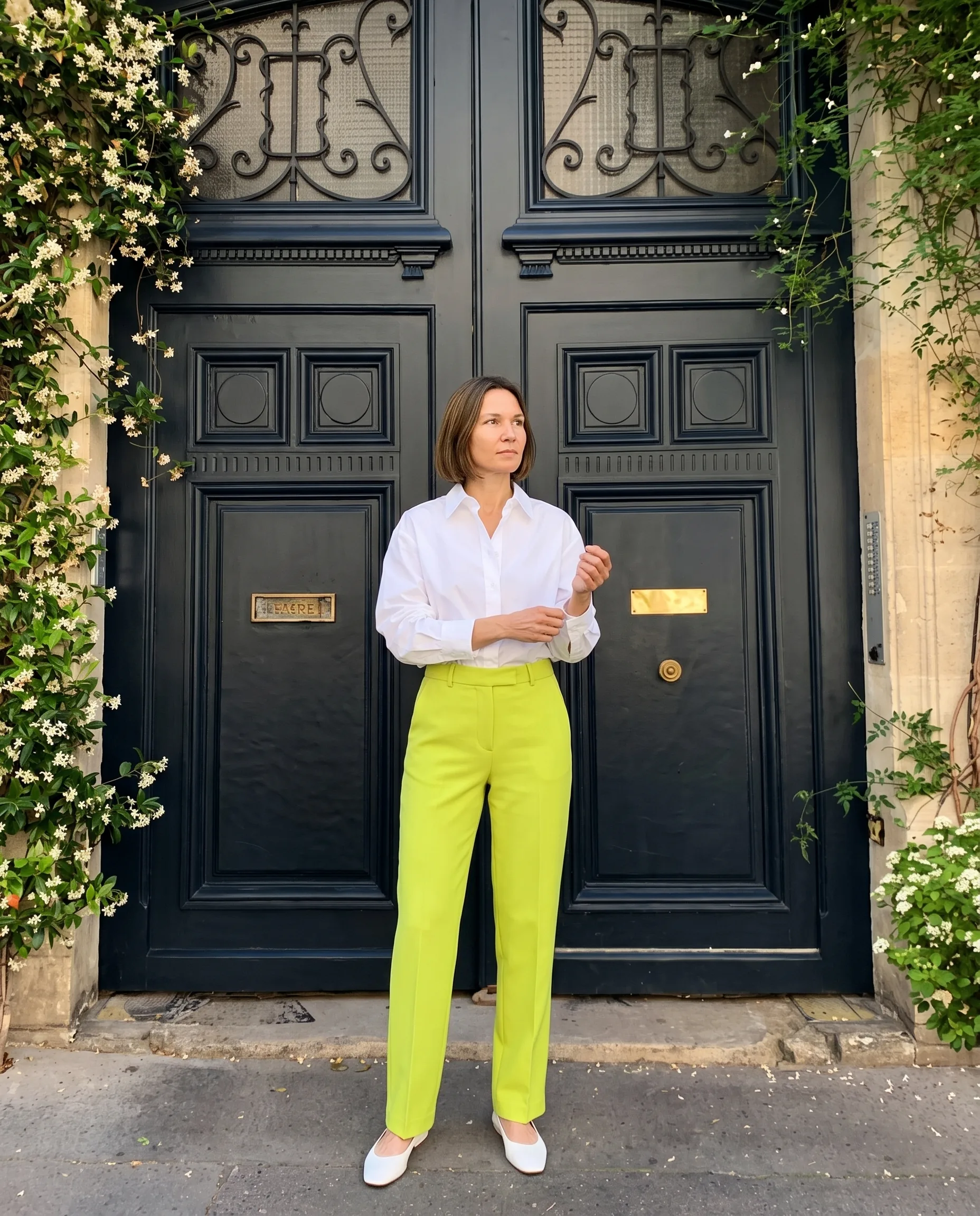
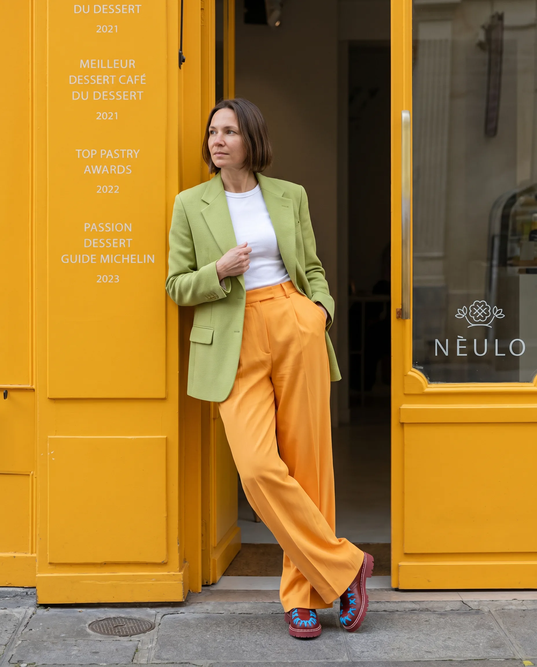
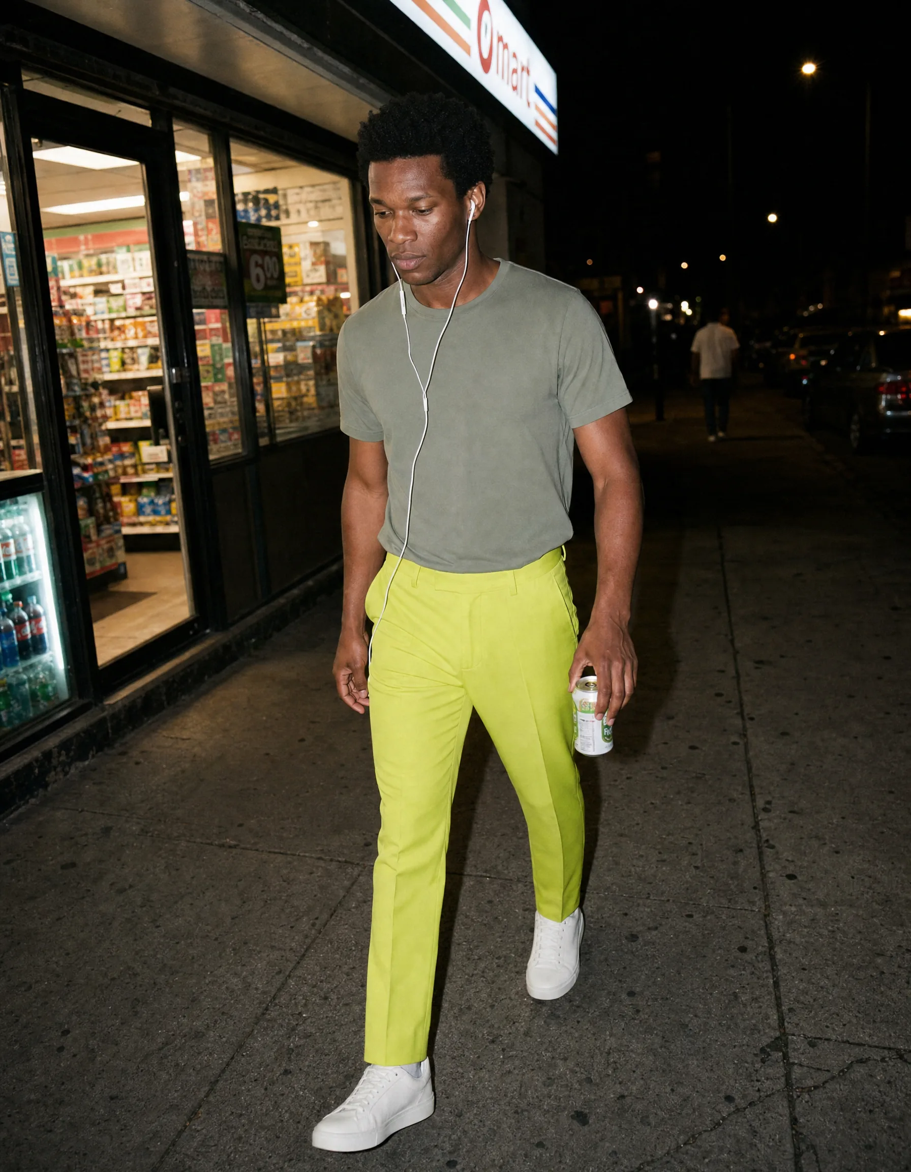
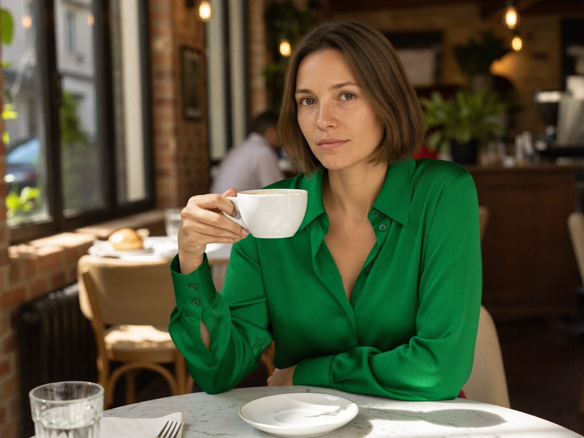
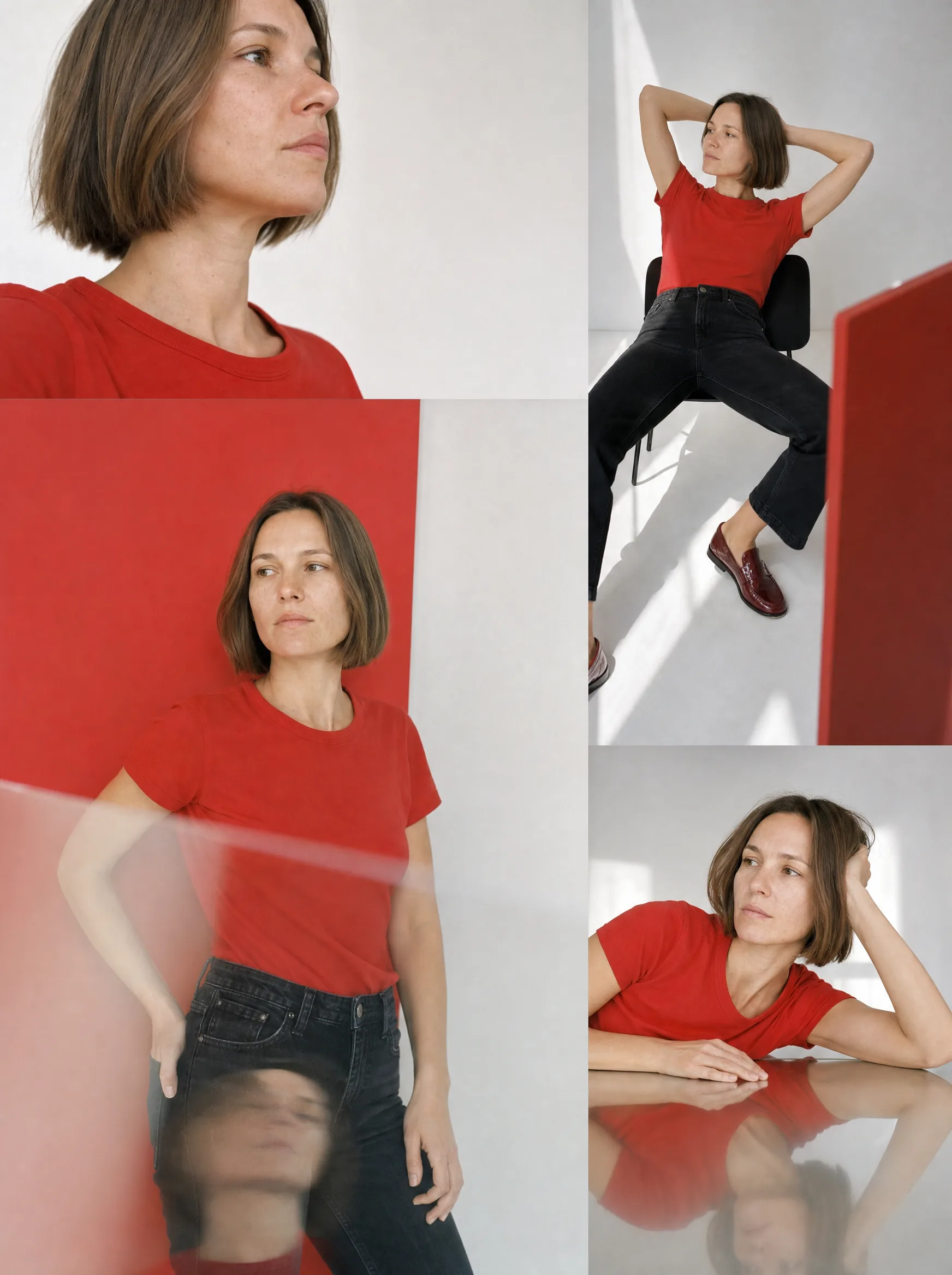
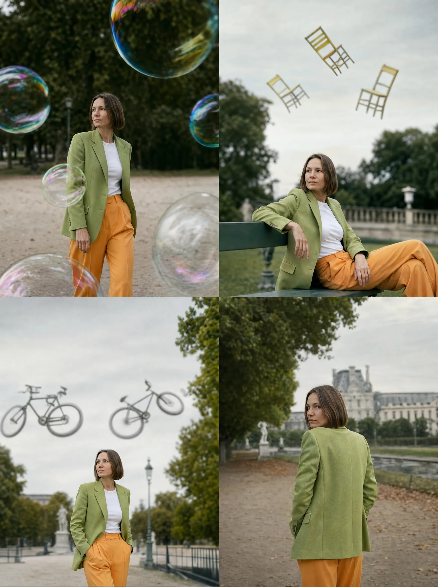
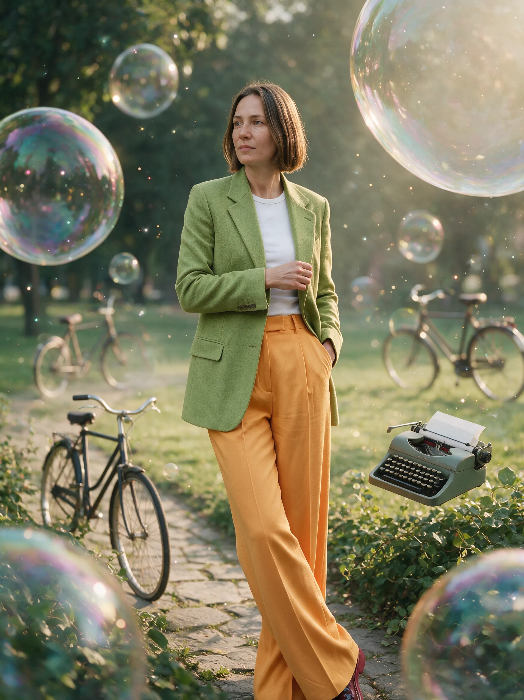
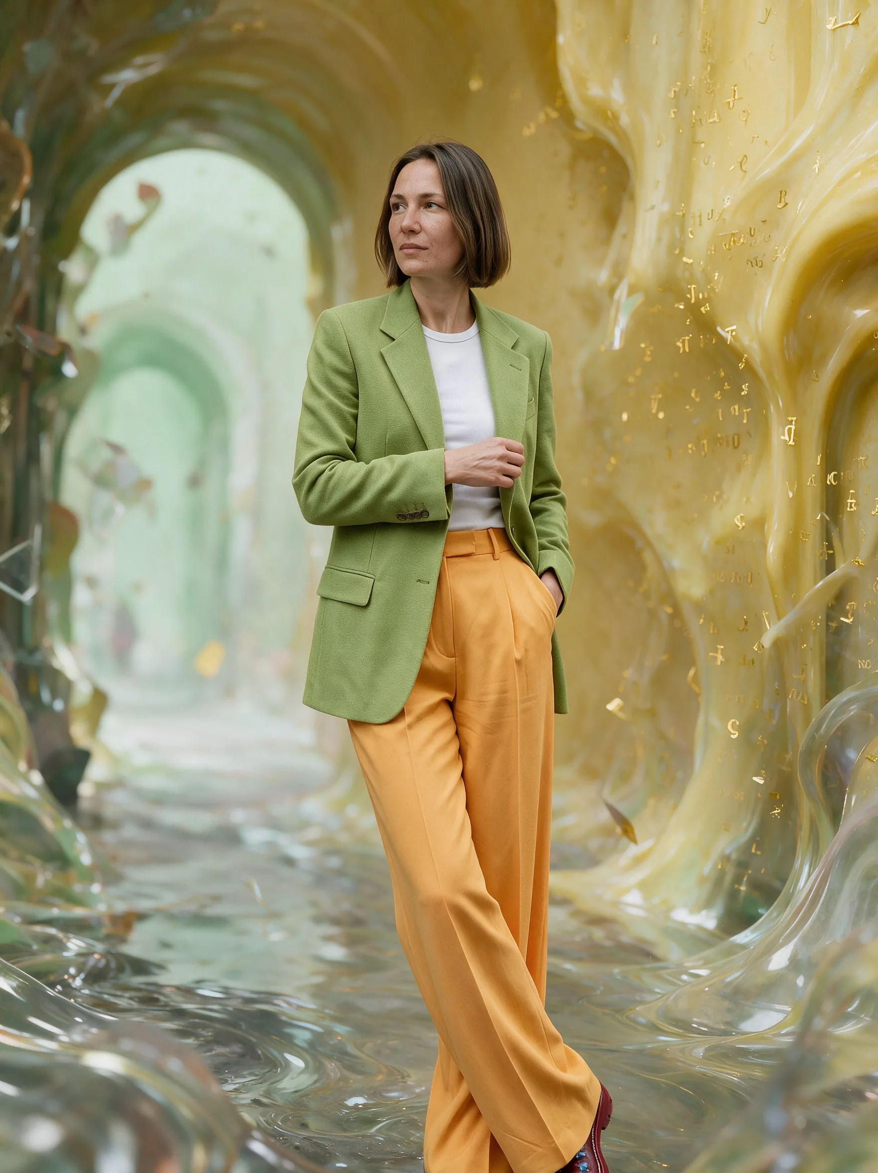
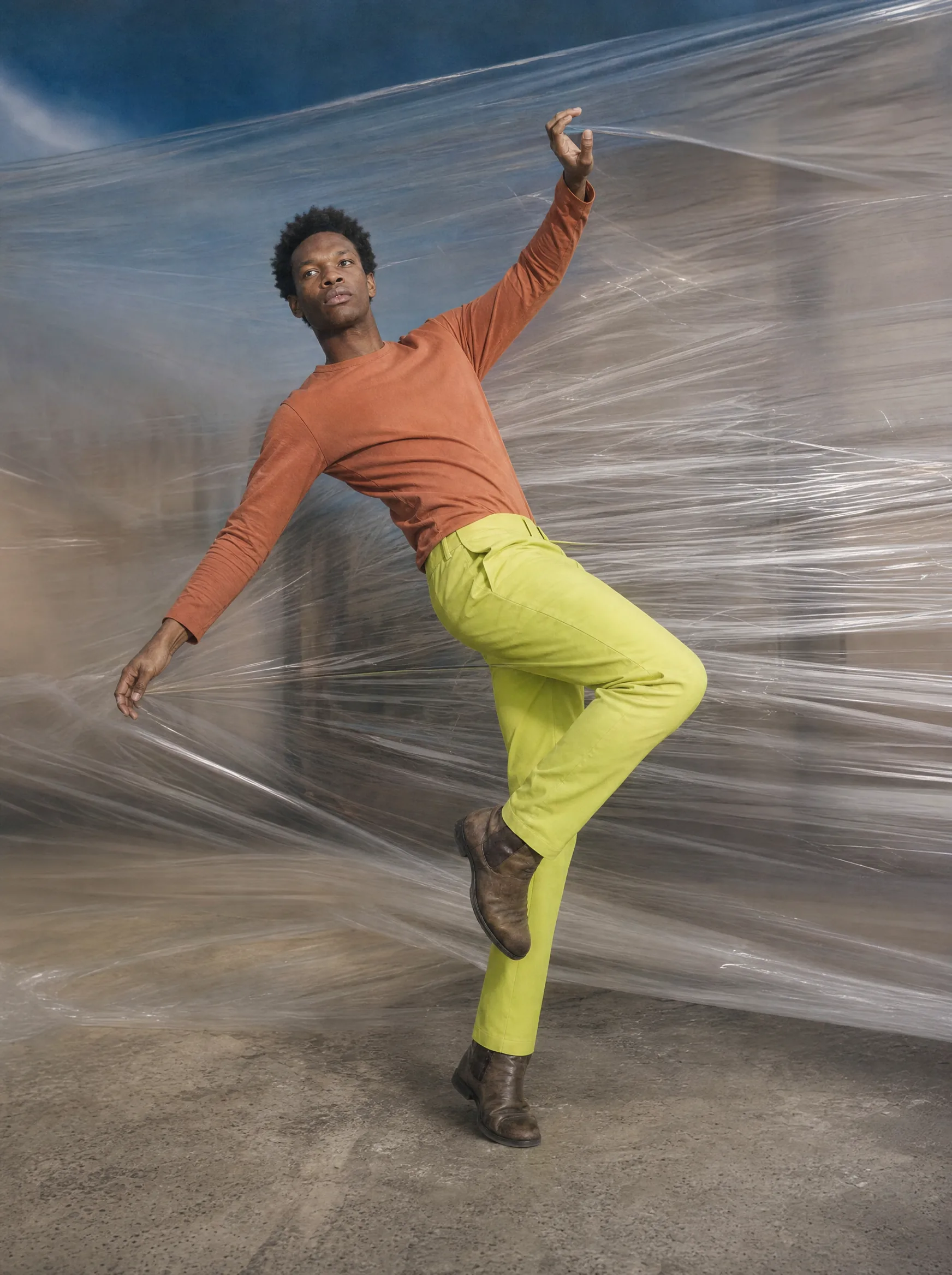
Location work, street-style frames and studio portraits — the whole set the campaign and the store were cut from.



Motion for the feed
Vertical pieces built to be watched with the sound off and the thumb hovering. Each one opens on Vimeo when you press play — nothing loads until then.
“Built For Strut”
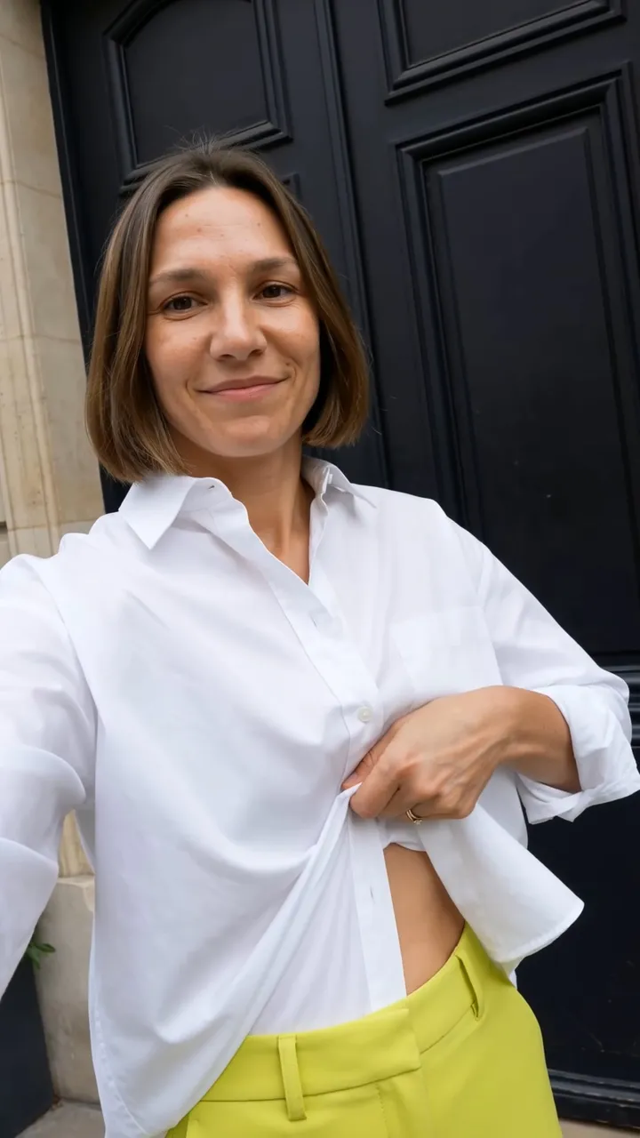
An AI UGC-style campaign built around an original track, scripted, cast and cut to feel native to the feed rather than like an ad interrupting one. Below is the compiled reel; six individual clips fed into it.
Product in movement
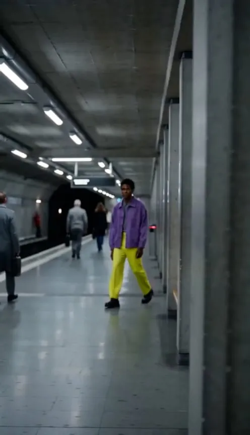
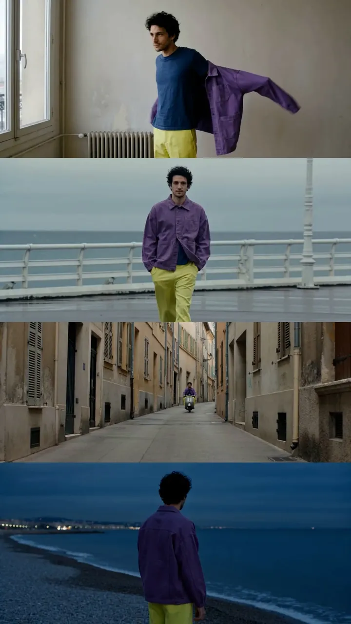
Four short vertical pieces: colourwear moving against plain walls, fabric close enough to read, and the street as the backdrop.

Copy that confirms, not convinces
One question, one answer, and a line for every channel. Three verbal traits hold it together: conviction without preaching, precision as an attitude, closeness from equal footing.
A question that stops, an answer that closes
The question makes the reader ask it of themselves. “Yes, I am here.” is the answer the garment lets them give — first person, spoken by whoever wears it. It closes every piece and is never translated.
| Channel | Audience | Copy |
|---|---|---|
| Homepage | All | ¿Cuánto tiempo llevas eligiendo no ser visto? / Yes, I am here.How long have you been choosing not to be seen? / Yes, I am here. |
| Instagram 1 | The one daring now | El primer día que lo llevas es el último que lo dudas.The first day you wear it is the last day you doubt it. |
| Instagram 2 | Visible nonconformist | Siempre supiste que el gris no era para ti.You always knew grey wasn’t for you. |
| Instagram 3 | Converted sceptic | Producción verificable. Diseño sin rodeos.Verifiable production. Design without detours. |
| X | All | El negro no es neutral. Es rendición.Black isn’t neutral. It’s surrender. |
| X | All | El color no pide permiso. Tú tampoco.Colour doesn’t ask permission. Neither do you. |
| Billboard | All | Yes, I am here.Left in English in every market, by design. |
Written in Spanish for European markets, with the English translation underneath.
Every line has a reason to exist
Brief first, AI draft second, my edit last — I cut for clarity and remove anything generic. The final line and the V2 subheadline below have been edited for this portfolio to remove production and certification claims the concept could not support.
"At KROMA we believe fashion can be different. We're a brand committed to the environment, offering you unique and authentic pieces so you can express your true self without giving up your values. Join the sustainable revolution!"
- "we believe" → doubt, not conviction
- "committed to the environment" → unverifiable claim
- "unique and authentic" → prohibited empty adjectives
- "your true self" → condescending
- "join us!" → summons, doesn't recognize
"For too long, the market kept color on one side and responsibility on the other. Colorful design. If you already knew grey wasn't for you, here's the rest. Yes, I'm here."
| Version | Headline | Subheadline | Use |
|---|---|---|---|
| V1 · Cold tease | How long have you been choosing not to be seen? | The color you always knew was yours. | First impact |
| V2 · Reframe | Black isn't neutral. It's surrender. | FW26–27. Real color. | Retargeting |
| V3 · Statement | Yes, I'm here. | For those who already decided who they are. | Launch |
A Shopify prototype — imagery, copy and product pages
The prototype holds seven concept products with imagery, descriptions and collection pages. It is a demonstration, not a trading store.